Visualizing and Analyzing Data
- tombond912
- Oct 23, 2020
- 4 min read
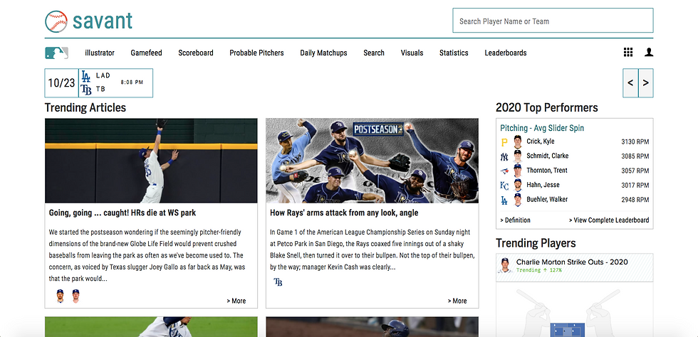
This week’s blog post comes with much excitement due to my interest in data visualization and its impact on baseball. When posed with deciding what data to use, I immediately jumped to the website I use for baseball analytics, Baseball Savant.

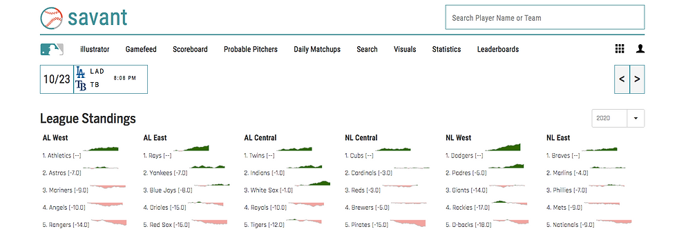
This website has everything a fan of baseball or analytics could ask for. Between visuals, statistics, leaderboard, game matchups and much more, the breakdowns are endless. With date/analytics becoming widely discussed around baseball and other sports, websites like Baseball Savant will become visited more frequently. It is hard to deny the importance of analyzing data, especially when teams find a tremendous amount of success doing it.
For the non-baseball fan, you may have heard of the movie “Moneyball” that starred Brad Pitt, Jonah Hill, Phillip Seymour Hoffman, Robin Wright and many more critically acclaimed actors and actresses. The main focus of the film is how a low budget Oakland Athletics team used data and analytics to generate a team that ended up winning 103 games.

The rest is history after that. Since then, analytics has absolutely exploded. Any team that does not use it is a fool and the teams that utilize it the best reap the rewards. For example, one of the main reasons the Tampa Bay Rays, who have the 3rd LOWEST payroll in all of baseball, made the World Series is because of their belief in trusting the numbers. They trust it so much that they’ve placed a Data Analyst in their dugout during all games!
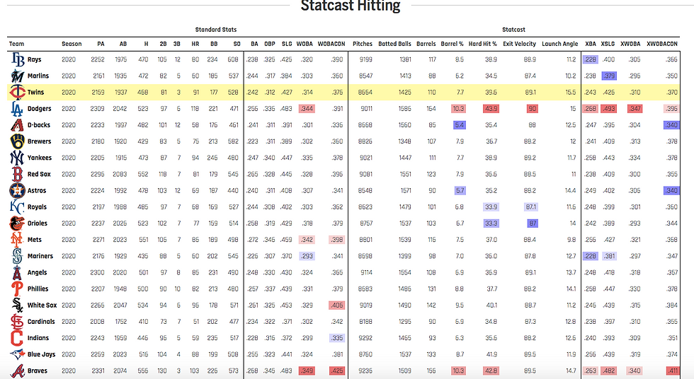
Okay, so enough of my personal interest and let’s get down to the numbers. The data I decided to explore this week was straightforward and easy to follow whether you are or are not a fan of baseball. I went to Baseball Savant’s team hitting leaderboard for 2020.


There you will find statistics and statcast numbers. Both of which can be interpreted, visualized and predicted using their relationships. Without seeing Win and Losses, you would be able to have a sense for who was the best using these statistics only. For the assignment’s purpose, I decided to look at the MLB Top 10 Hard Hit % Leaders. A hard hit ball is considered any ball that is hit 95 MPH or higher. Using the Data Visualization tool infogram, I created a table with all of the specific stats I felt were worth mentioning in order to paint a picture for us to see what is going on. Below you will see the chart in its entirety. I chose this tool because it was user friendly, able to depict the date accurately/effectively and quite honestly was just the first one I found.

Before breaking down any numbers, I want to point the focus to the Key at the bottom of the graph. That may help answer any questions when trying to figure out what all the letters at the top of each column mean. Shifting our attention, the main focus of the graph is how Hard Hit % correlates to scoring runs. As we can see, 4 out of the top 5 teams in Hard Hit % are also in the top 5 for runs scored in 2020. Clearly a high positive correlation between the two. Given the results, our expectation would be that 6th-10th in hard hit percentage would correlate to 6th-10th in runs too. Clearly this is not the case. That is where the categories in between Hard Hit % and Runs have the ability to help us understand why. Weighted On-Base Average (WOBA) and Weighted On-Base Average with Only Contact (WOBACON) are two statistical measures that give us our answer or at least part of the answer.
Let's dig deeper.
We must begin with an important note that the statistic Hard Hit % ONLY calculates batted balls in play. This means if a batter swings and misses, it does not increase or decrease the hard hit %. WOBA, however, is determined by the percentage of times the player reaches base and is weighted based on HOW he reached. For instance, a homerun is worth 2.101 times, while a walk is only worth 0.69 times on base. If we glance at the Twins, Cubs and Tigers, we know they are top 10 for Hard Hit % yet below the league average in runs. If we look at all three deeper, they noticeably have lower WOBA. Why do you believe this happened to them?


…
My interpretation of this data would be that the Twins, Cubs and Tigers most likely either strikeout more, walk less or hit fewer homeruns than the other teams.
Lastly, I must include the reason for adding the ‘expected’ statistics in my data. Expected stats are based on a compilation of advanced statistics such as exit velocity, launch angle, runner’s speed, defensive strength, ball park metrics..etc. The point being, when you compare expected statistics vs actual statistics, you can measure whether a team is playing above or below their “mean”. For example, the Giants must have had an unlucky 2020 season. I say this considering their WOBACON was .289 but xWOBACON was .375. Giants were 22% below where they should have been. On the contrary, the Rays, Braves and White Sox all significantly out performed their expected statistics. Over a course of 162 games this typically will allow teams to even out. However, in a season with only 60 games and not many off days, data found a harder time settling down this past summer.
If you have made it this far through the blog post, I appreciate you taking the time to read this. I can imagine baseball analytics is a dry subject for most people. What I learned most from doing this activity was not that the Cubs needed to strikeout less, or the Giants were unlucky, but that data visualization can be applicable in many ways and certainly attainable for everyone’s use. Whether you are teaching Science, ELA, History, Math, or any other subject, data can be used to tell a story and only enhance a student’s understanding further.
Thank you for reading!


Thanks! I agree, I also find myself fascinated with statistics more than the game itself sometimes. This particularly happens when comparing the past to present.
When doing my analysis, I became aware of a few things. I did not realize the Cubs, Giants and Tigers were in the top 10 in hard hit balls. I knew all three struggled with scoring runs, but did not know they were hitting the ball hard. Through my analysis, I concluded that the Cubs and Tigers really struggled with making contact and getting on base via walk/hpb. I decided to more research on my own. In my findings, the Cubs and Tigers both struck out 5th and 6th most, respectively, in the MLB. Additionally…
Tom,
Thanks for all the enthusiasm you brought to this post. Perhaps interestingly, I am far more fascinated by sports (especially baseball) statistics than I am in the game itself. I am not sure what this says about me.
Moneyball is one of my favorite movies and I have seen it several times. I particularly like how they use visualizations to show data during the movie. For example, using box scores to show the rise in the A's progress (coupled with voice-over narration).
One question I have is what did you learn doing your analysis that you did not already know about these teams?